What to Wear for Cinematic Photos
May 2, 2025
A Color Story Rooted in Nature.
Because the colors you wear? They help tell the story.
When people land on my page and scroll through, they often say:
“There’s just something about your images—they feel like art… like a movie still.” And then they wonder what to wear for their session.
And while lighting, movement, and mood are part of that… what you wear plays a big role in how the image feels. This isn’t about looking trendy. It’s about creating a visual atmosphere that matches the emotion of the moment.
And the easiest way to do that?
Wear colors that compliment the environment—not compete with it.
Nature Knows Best
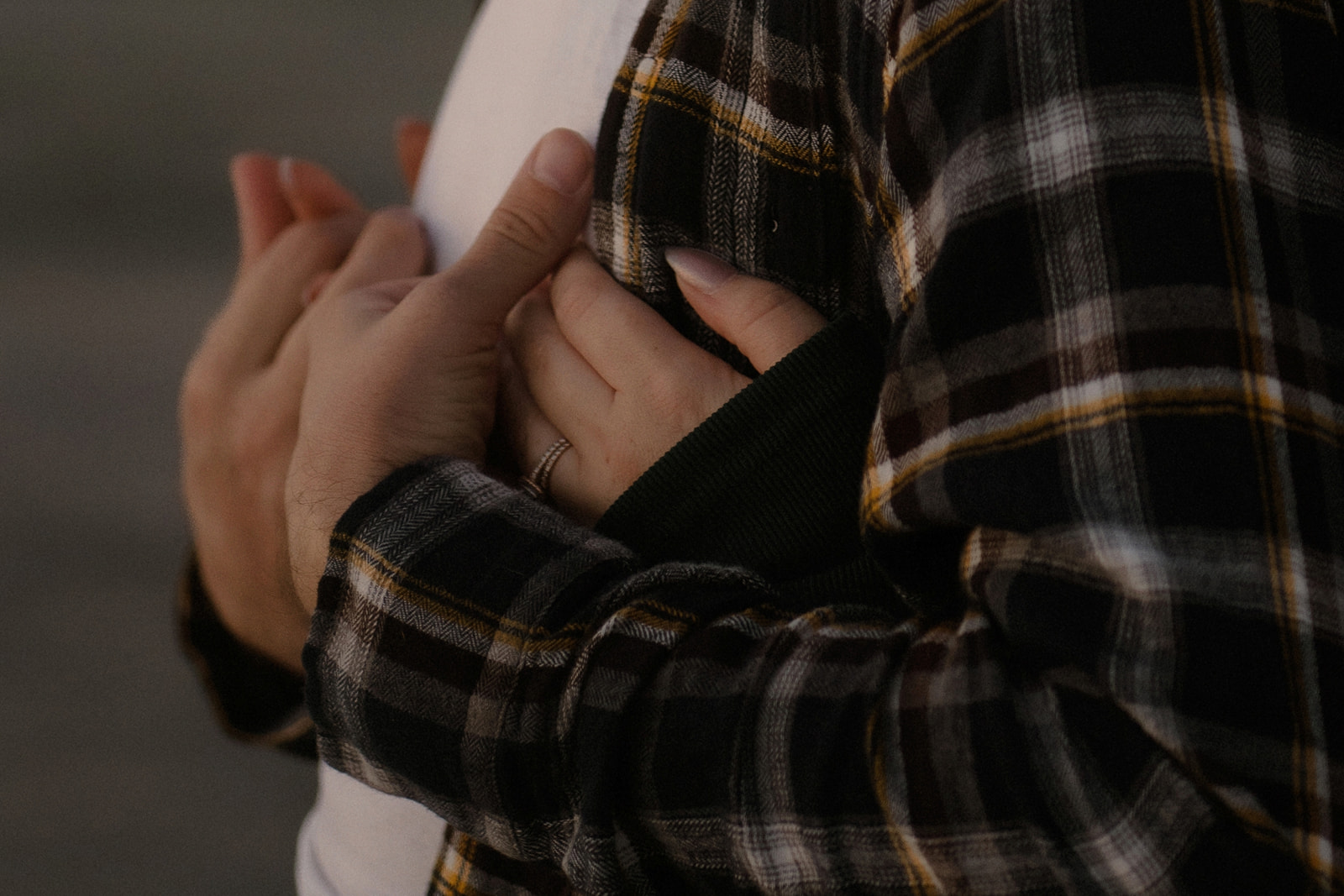
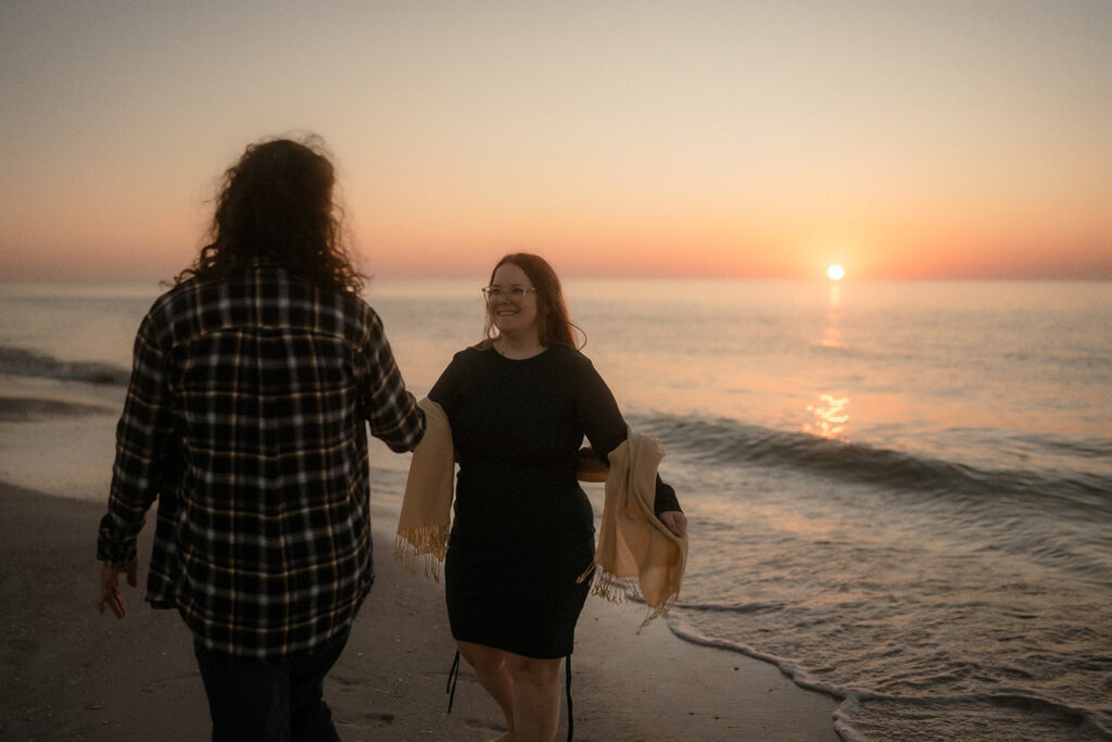
The tones that look the most cinematic are the ones we already find outdoors: fern greens, ocean blues, golden sunlit tones, warm rusts, and deep shadows.
And these colors do more than look pretty. They create harmony.
In color theory, this is called analogous harmony. Tones that sit near each other on the color wheel, found naturally in the same environments. They soothe the eye, create flow and whisper rather than shout.
And that’s the magic!
When your clothing echoes the palette of the environment, the focus shifts. Suddenly, it’s not about the outfit, it’s about the connection, the emotion, the story.
These tones feel grounded, timeless, and intentional. Which is why they translate so beautifully in cinematic imagery. They allow your presence to take center stage… without distraction. Because what we’re capturing isn’t perfection. It’s presence.
Color Guide: What Photographs Best
To keep the focus on emotion, movement, and connection, I like to recommend:
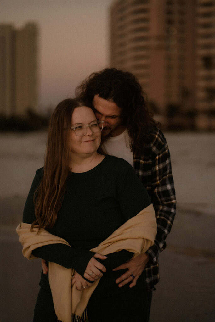
- Deep greens
- Burnt sienna
- Ochre/gold
- Slate blue
- Burgundy
- Warm neutrals (cream, oatmeal, tan)
- Cool neutrals (black, navy blue, gray)
Avoid neons and bright colors—they can overpower the mood
Let Contrast Be Your Guide
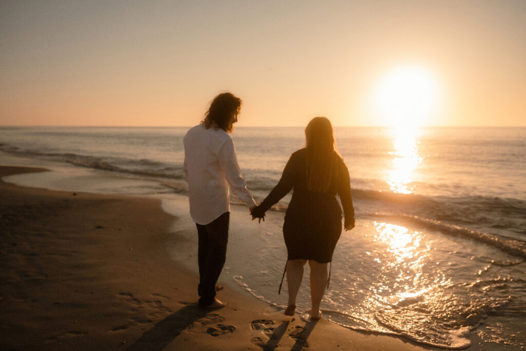
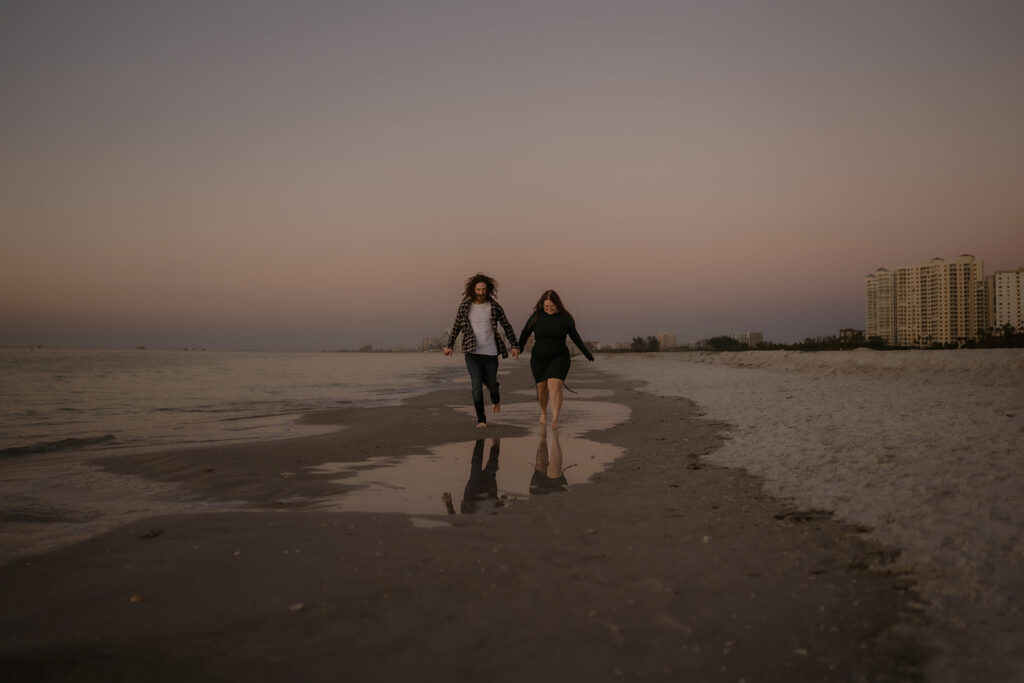
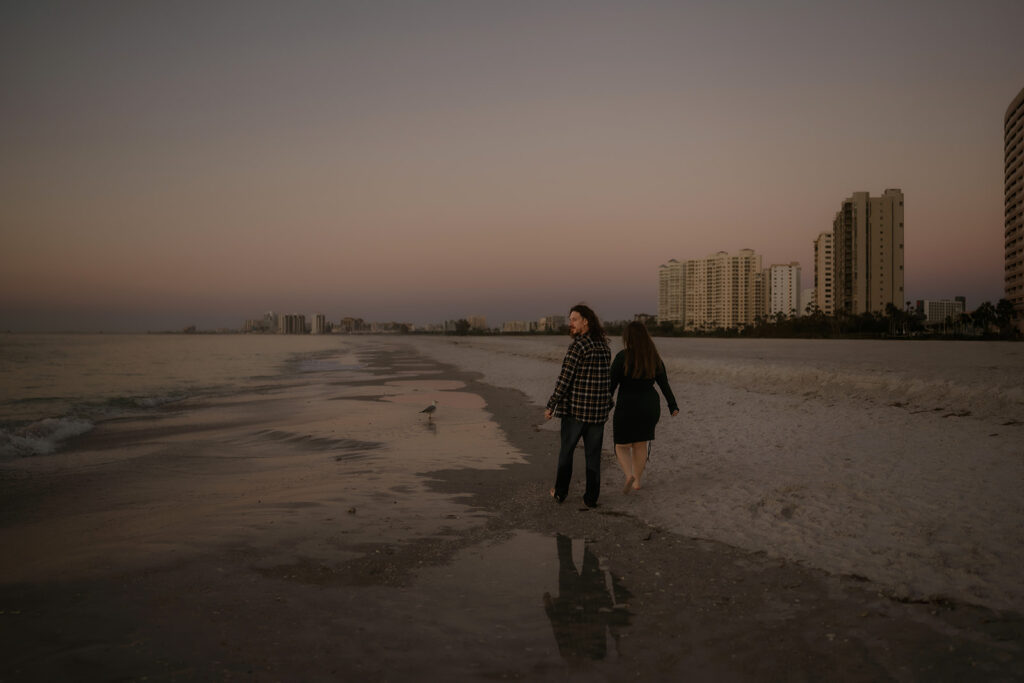
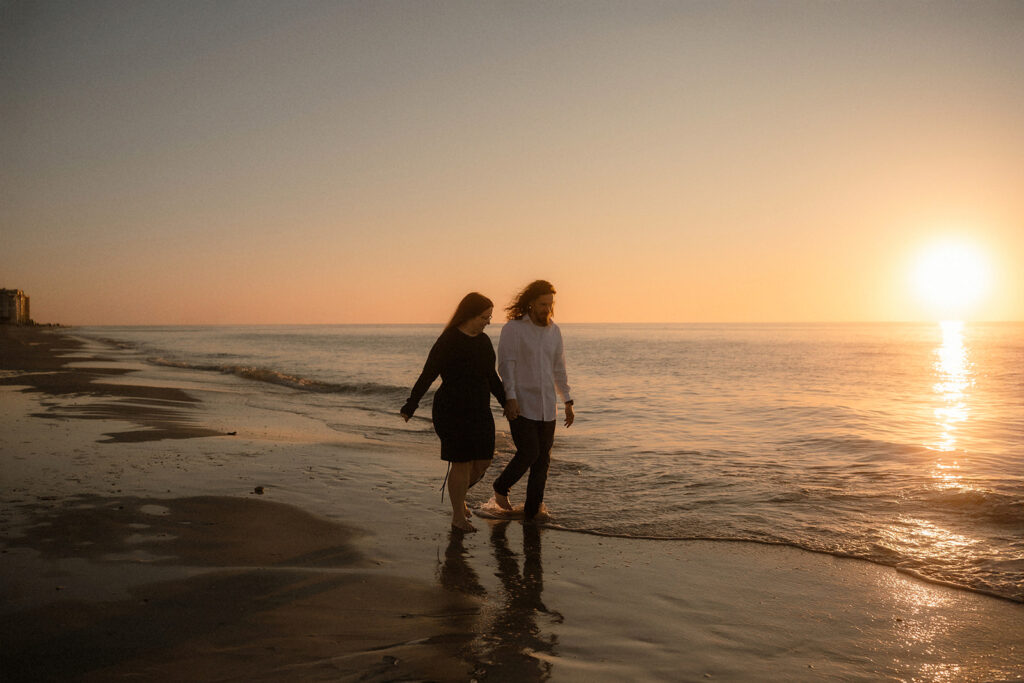
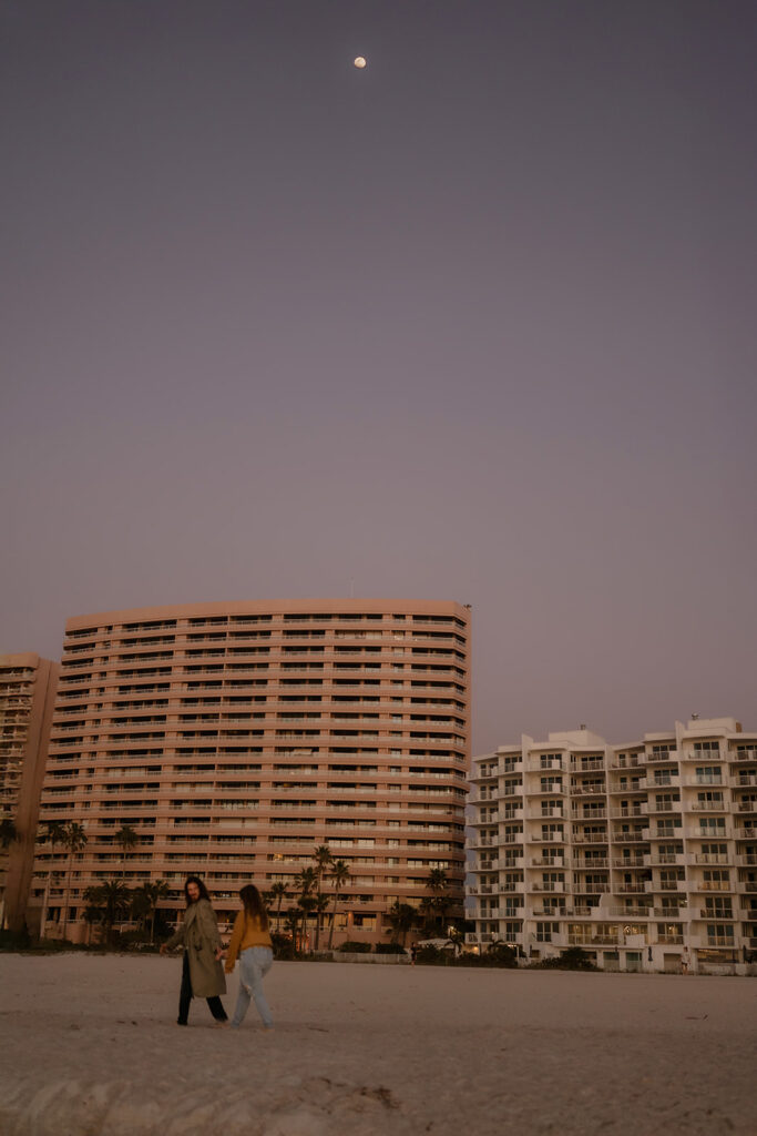
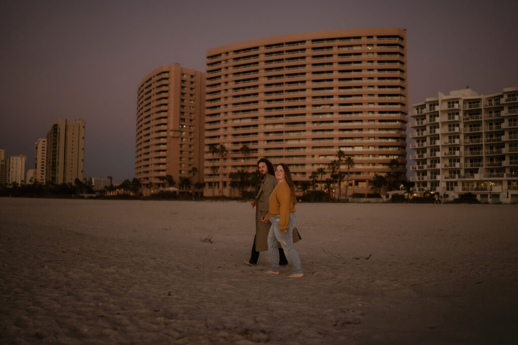
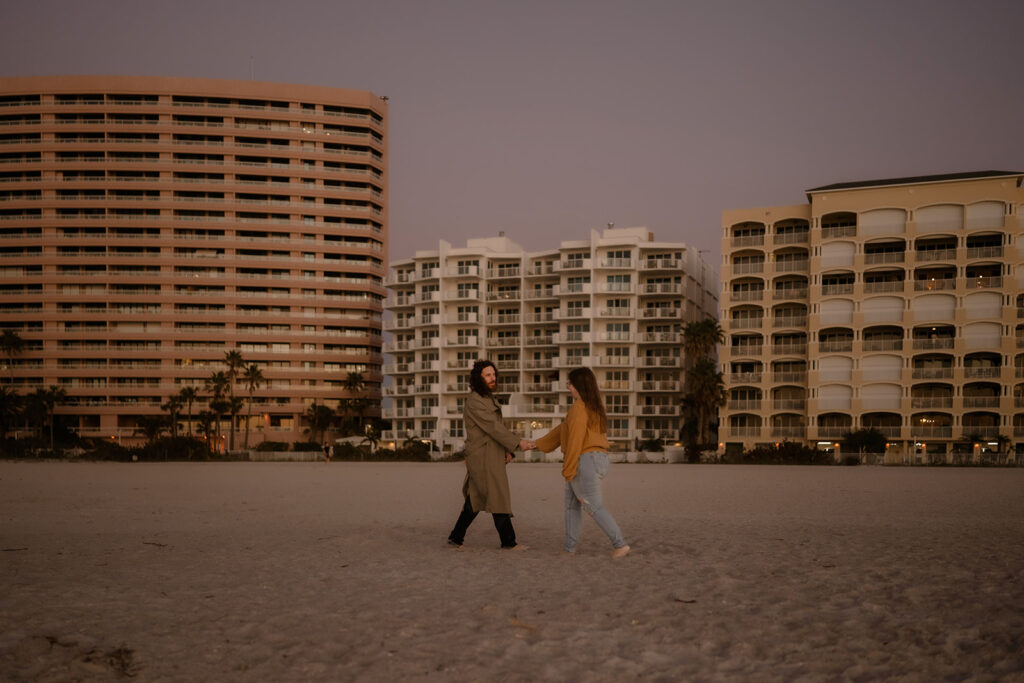
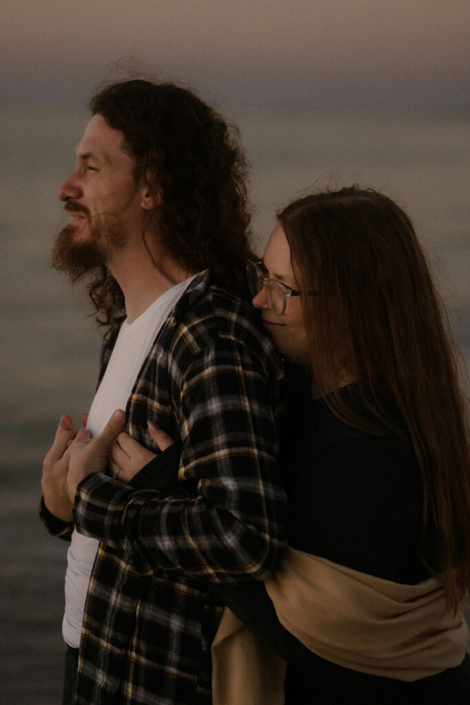
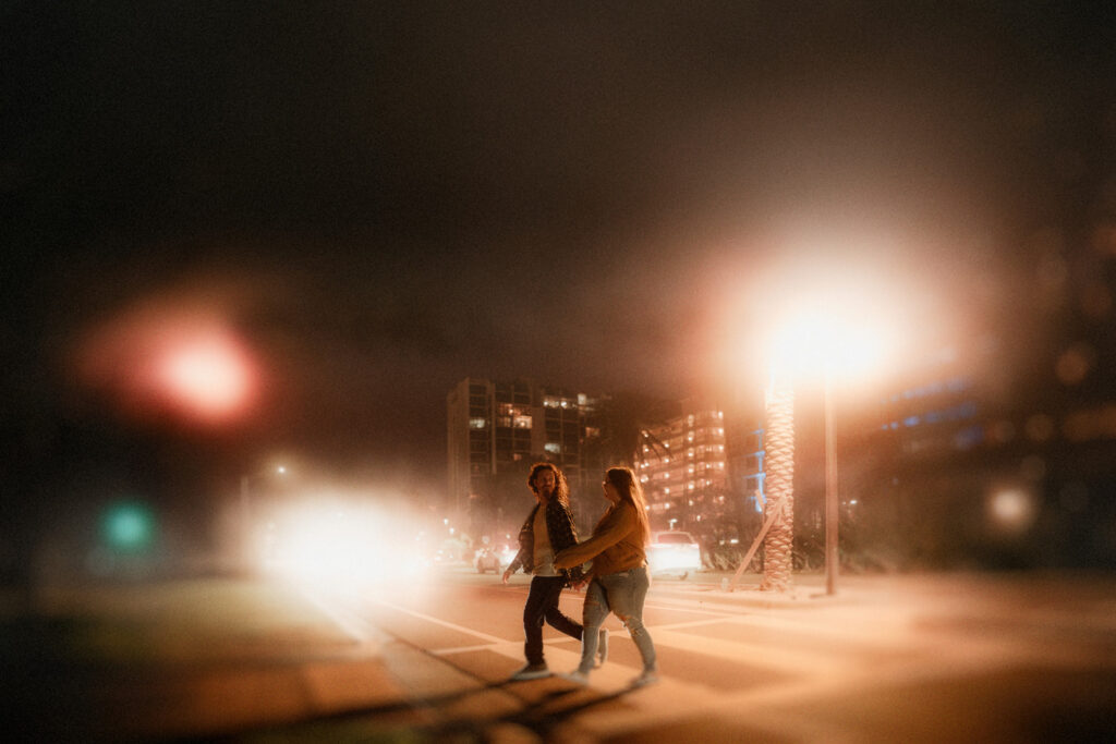
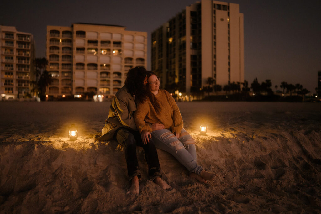
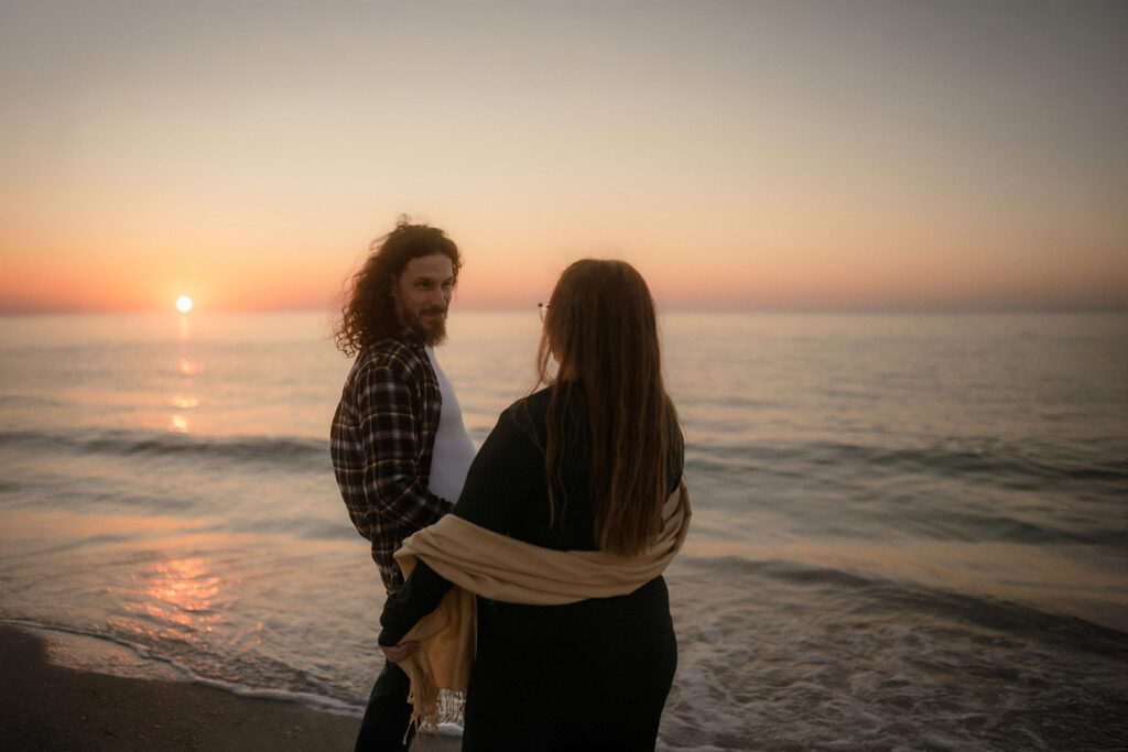
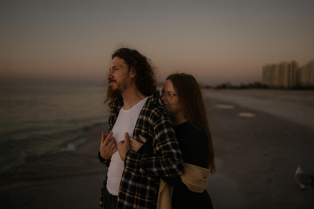
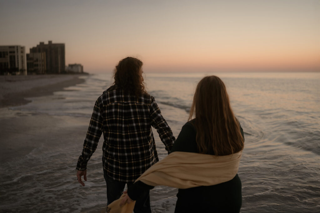
If your background is light (like a beach, open sky, or bright sandy dunes) wearing richer, deeper tones helps you stand out without looking harsh. Think deep greens, rust, burgundy, or slate blue. These tones ground the image and bring warmth and mood to a sun-soaked surrounding.
If your background is dark (like a wooded park, dense greenery, or shaded field) go with lighter tones like cream, oatmeal, soft sage, or light pink. These shades lift the image, bringing light into the shadows and letting your presence glow against the backdrop.
It all comes down to one thing: contrast.
Not dramatic or jarring, but a thoughtful subtle contrast that brings focus exactly where we want it.
Because when there’s visual balance between subject and scene, the eye knows exactly where to land. It lands on the moment. On the story. On you.
Texture, Layers, Movement
Once you’ve chosen colors that reflect the setting, it’s time to think about how your clothing moves.
Because cinematic photos aren’t stiff… they breathe, they move.
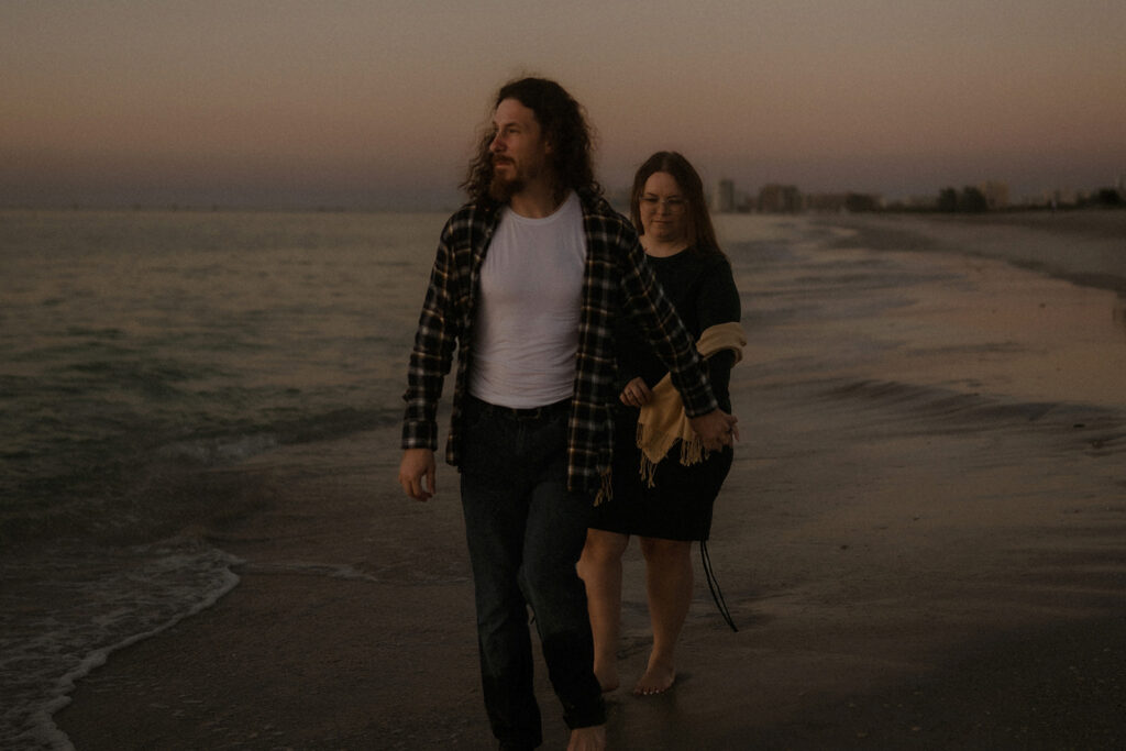
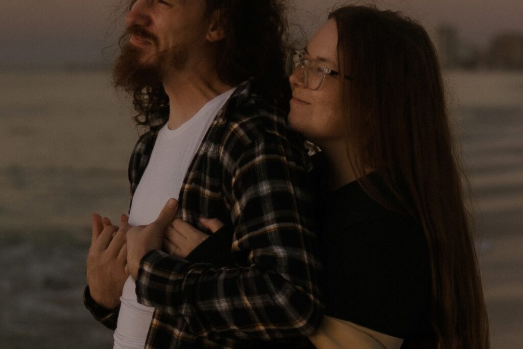
Flowing fabric like cotton, gauze, linen, silk blends, and rayon—catch the breeze and dance with you.
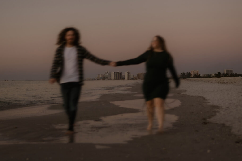
A long dress that trails behind or lifts slightly as you walk? That’s motion. That’s emotion. It’s what gives your images that film-still quality like you were caught in the middle of a moment, not staged for one.
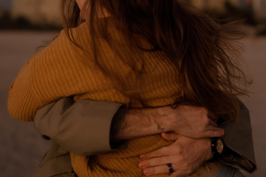
Layers add depth and tell a more nuanced story. A guy can wear an open button-down shirt over a tank top, letting it move freely with the wind. It adds texture, interest, and that relaxed, unfussy energy that works beautifully in natural environments.
And it’s not just about looking good! It’s about feeling free. The freedom to run, twirl, hug, laugh, explore… without worrying if your clothes are holding you back.
Bare feet on the beach. Wind-swept hair. A linen shirt catching golden hour. Those little details bring the scene to life and make it feel like you.
When in doubt, ask yourself: Will this move with me or work against me?
Cinematic moments don’t sit still. Neither should your wardrobe.
Dress the Mood You Want to Remember
The point of all this isn’t to make you look like someone else. It’s to make you feel most like yourself… in a version of the world that feels just a little more like art. There’s no one-size-fits-all formula. What matters most is that you feel comfortable, confident, and like you belong to the scene we’re creating together.
So here’s a tip I love to give clients:
Think of your favorite film. The one that lingers with you. The one where the light felt dreamy and the characters looked effortlessly beautiful in their world.
Now; what were they wearing?
Was it soft linen blowing in the wind? Earthy, lived-in layers? A splash of deep, moody color against a quiet backdrop? That’s not just styling. That’s storytelling.
Taking inspiration from a film you love can guide you in more ways than just clothes. It sets the vibe, the tone, the palette, the emotion. And when we bring that energy into your session, it creates something personal. Something cinematic. Something you’ll feel when you look back on.
So wear something that moves with you. Something that feels like you… but also like a version of yourself you might see on screen.
Final Thought
Nature Already Knows the Palette
Cinematic magic doesn’t happen by accident. It’s built with intention. Through light, emotion, and yes… wardrobe.
So if you’re wondering what to wear, start by stepping outside. Look around. The colors are already there… you’ll find them woven into the sand, the sky, the trees. Soft and soulful. Warm and wild. Moody and golden.
And when those tones make their way into your clothing, something clicks. The image feels whole. You feel at home in the frame.
To help you get started, I’ve curated a collection of Pinterest boards filled with color palettes, outfit inspiration, and wardrobe pairings that reflect the cinematic feel you see in my work. You’ll find boards for couples, families, and solo sessions—each one created with movement, emotion, and visual storytelling in mind.
Because this isn’t just about what you wear. It’s about how it makes you feel—and the story it helps tell.
And if you’re drawn to this way of seeing… this slower, more intentional kind of storytelling. You might also enjoy my last journal entry: Shooting with Feeling: My Approach to Cinematic Images. It’s a deeper look at how emotion and atmosphere guide everything I do behind the lens.
Be the first to comment